We designed a simple, intuitive and playful e-commerce site to engage customer’s curiosity but to also allow the products to be the hero and showcase the brand’s greatest tool, the wax printed fabric.
My role
Visual Design
Branding & Identity
Concepting & Ideation
User Research
UI Design
Wireframing
Responsive Web Design
Print/Layout Design
Company
ULO

Directing the UI & UX
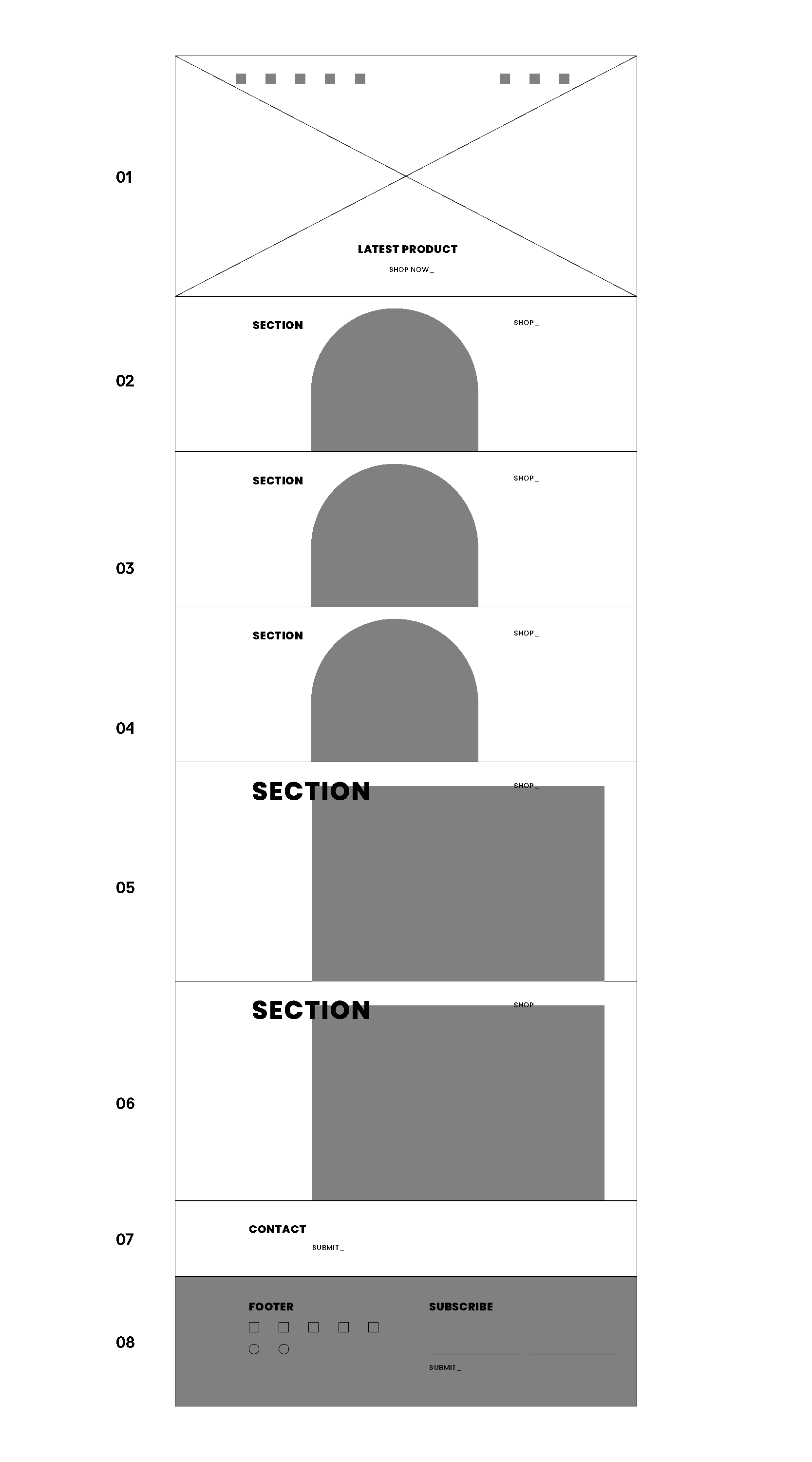
I chose the look and feel of the UI to match the warm tones of the extensive colour palette. When designing the site my main goal was to make it clear, accessible, and engaging and to allow the brand’s playfulness to shine through. I did this through the integration of custom shapes for image blocks. Based on customer feedback, analytics and interviews the design responded to key demographics. Prioritising those demographics directed the hierarchy of the layout of sections in a block format.


The visual language
To build out the visual language, I created a system of coloured shapes that were referenced and inspired by the wooden blocks used to create the patterned wax print fabric. Bright colours were then added to the shapes to create playful patterns and support imagery of the products but to also build up the visual identity of the brand. The ULO brand was strategically positioned as honest, bold, and connected, and above all to bring joy.

Evolving the logo
I refined the existing logo and selected Poppins as the typeface to build out the brand’s communications. Each letterform is nearly monolinear, with optical corrections applied to stroke joints where necessary to maintain an even typographic colour. These typeface characteristics paired nicely with the patterns found in the wax print fabric used in all the products.

Outcome
The evolved branding was well received at a new product line launch and improved online conversion by 3.8%.
